-
BICS Dark grey
The main color version of the logo to use whenever possible -
BICS White
To use on top of one of the BICS grey or one of the BICS blues, or on top of an image for enhanced visibility.
Our branding
Building the BICS brand experience is an ongoing effort. It is important that we are consistent in our communication and experience across all applications. The BICS brand design is minimalistic, clean and simple, elegant and light, authentic and people focused.

-
Logo colors
-
Size and spacing
-
Negative usage
-
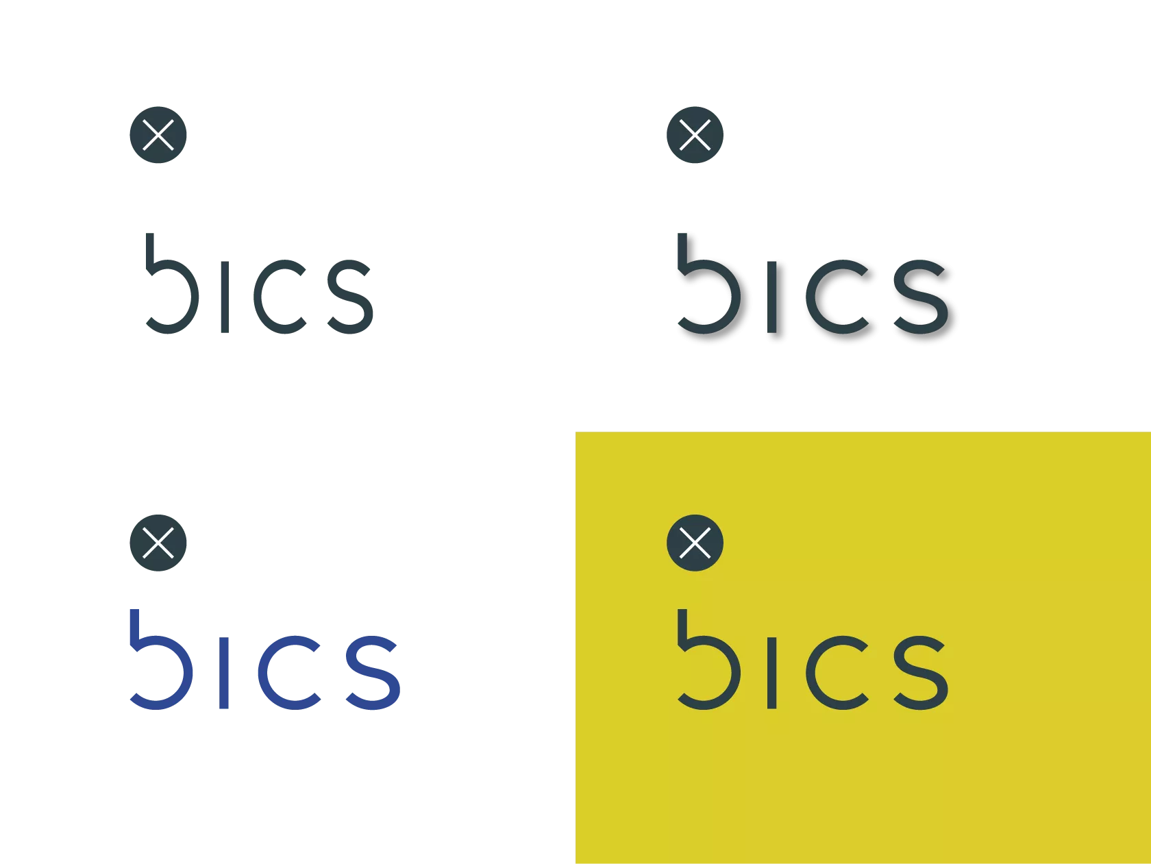
Don’ts


-
Minimum size
The logo must be applied at a minimum of 19px in digital and 5mm in print. -
Clearance
Graphics/objects must not penetrate the clear area. This space is no less than the x-height of the typo.


-
Do not scale disproportionately
-
Do not put the logo on any other background color
-
Do not add shadow

Color guideline
Lorem ipsum dolor sit amet, consectetur adipiscing elit. Fusce et mauris ut nulla condimentum tristique. Aenean vel enim sed sapien elementum auctor. Nam in massa vel enim lacinia dictum non id nulla. In finibus quis magna id imperdiet. Morbi non elit orci. Phasellus vehicula felis libero, ut ornare felis luctus vehicula. Proin sed finibus risus.
color codes
BICS Dark Grey
HEX: 2c3f46 RGB: 44 63 70 CMYK: 88 56 51 53 PANTONE: P8503
BICS White
HEX: F0F1F2 RGB: 240 241 242 CMYK: 7 4 5 0 PANTONE: P6197
